Our data visualization expert has three top tips for creating a clean report. However, it is important to remember that in writing a report you must first find the story, then do your analysis homework, and finally support those findings.
#1 Be Consistent Slide to Slide
- Use theme colors and templates
- Use the same font, even within the charts and tables
- Make the size of the charts and tables the same throughout the report
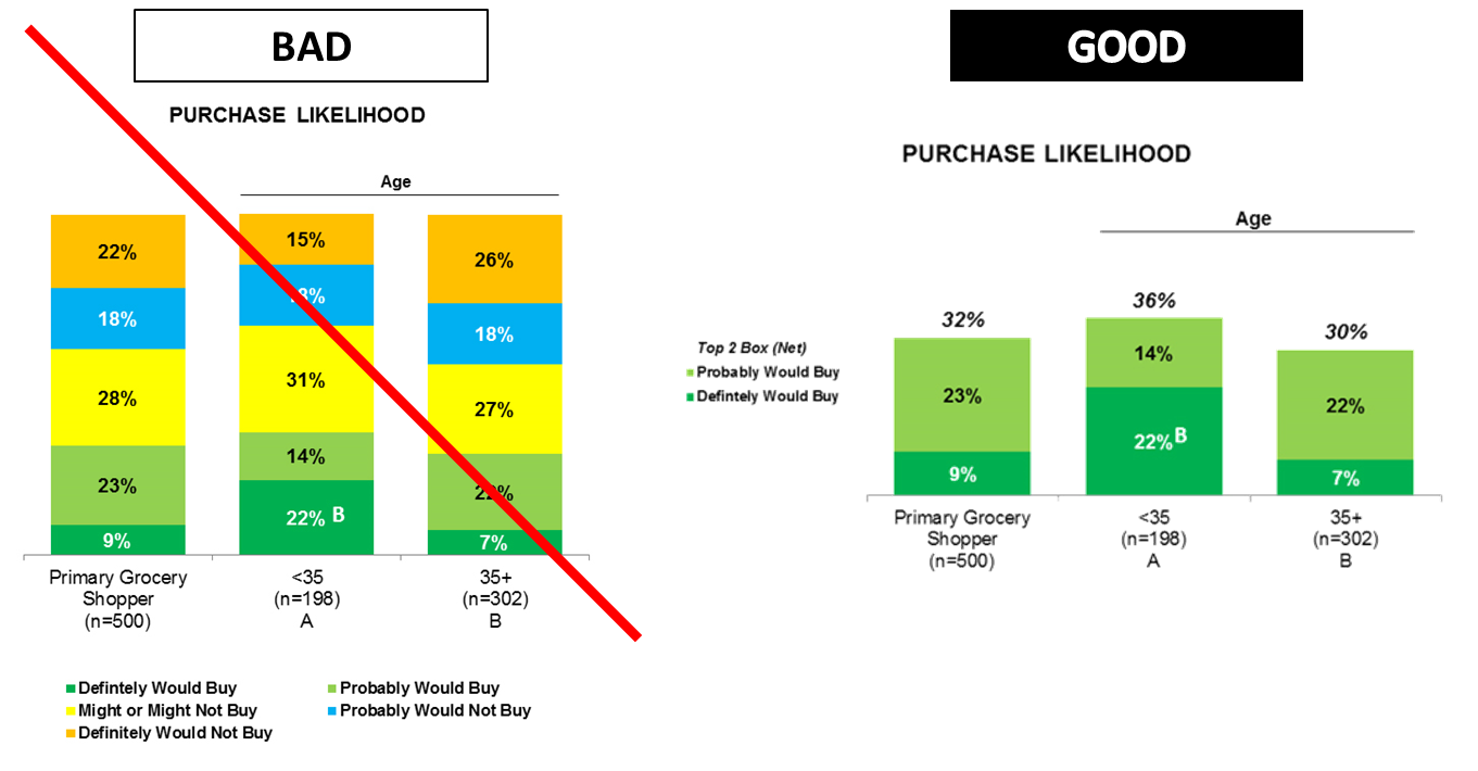
#2 Keep Charts Organized and Simple
- Legend should follow order of bar –
- If vertical bars, legend should also be vertical and clearly visible to LEFT of bars
- If horizontal bars, legend should also be horizontal and clearly visible at TOP of graph
- Only show necessary data. Avoid showing every point of each scale, when possible show only a summary.
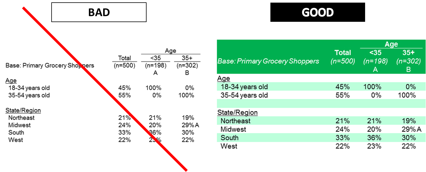
#3 Make Tables Easy to Read
- Rows should be easy-to-read and distinguishable from each other.